
Santi Pàmies is a Catalan jewelry house. Their workshop and showroom sit in Reus, an hour south of Barcelona, and the brand carries the kind of quiet authority you only get from a family that has been setting stones for decades.
The pieces speak for themselves on the counter. Online, they did not. The previous site was a serviceable catalog. Pieces in flat lighting, descriptions copy-pasted from a stock template, a checkout that read like an admin form. Nothing wrong with it. Nothing right with it either.
The brief was simple. Build a website that earns the work. Treat each ring like the object it is. Let the house feel like a house, not a marketplace.
Act 01
Photography that earns the case
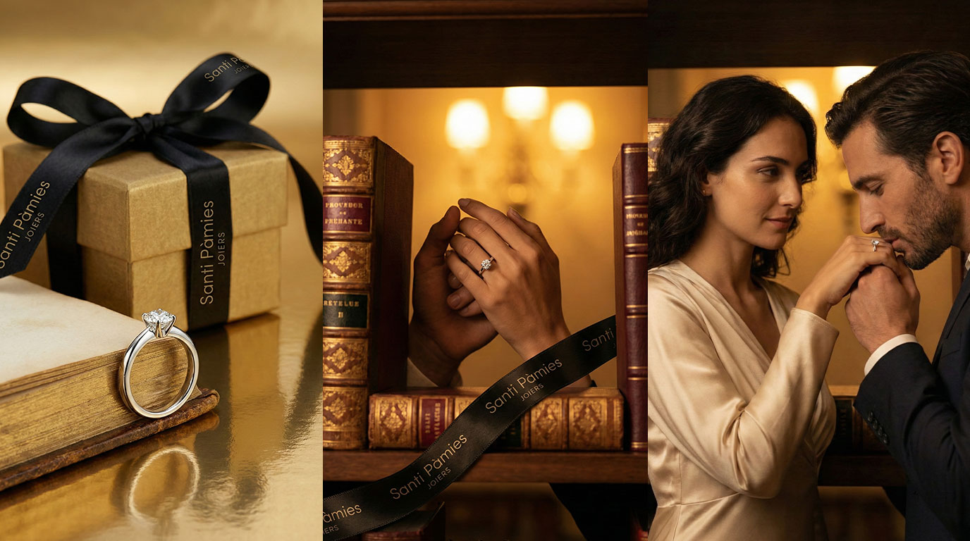
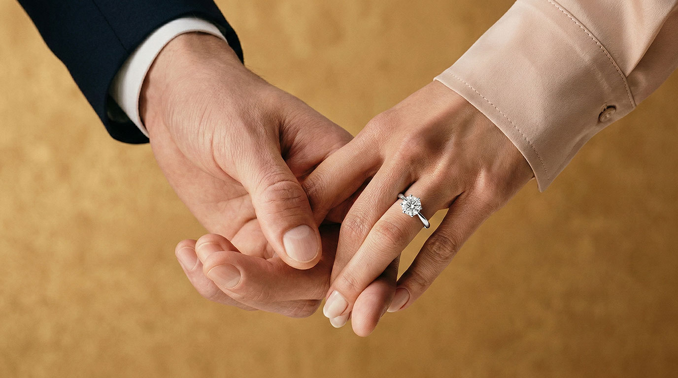
Most jewelry websites use the same handful of stock approaches. Piece on white. Piece on a model's hand. Piece on a velvet pad under hard top light. We have all seen them. They work for a feed and they fail at scale.
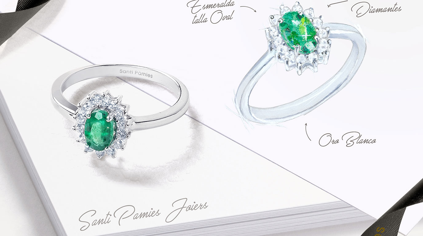
The whole visual library was rebuilt as AI imagery, with the existing studio photos used as the truth source. Geometry, stone count, claw setting, finish, weight in the hand. Every property of every piece had to survive the rebuild. The frame around the piece is what changed.
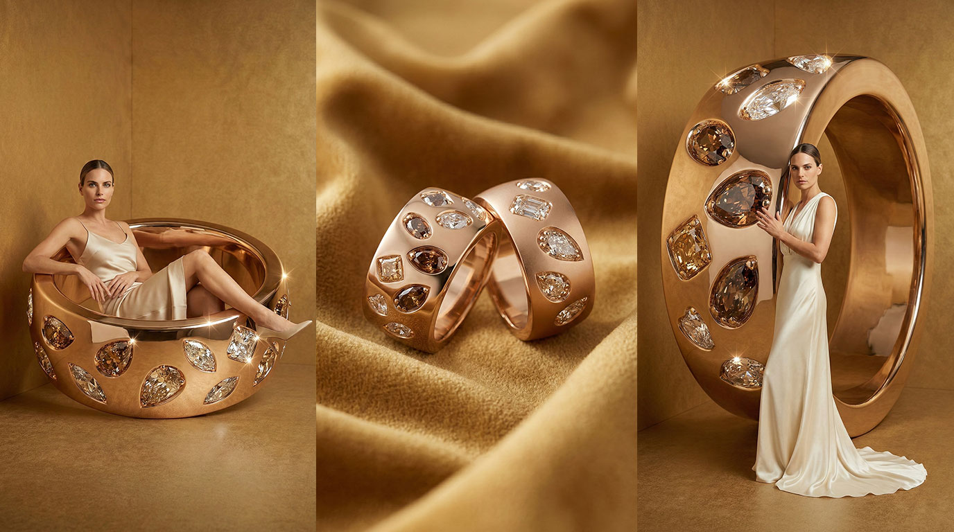
For each collection we wrote a brief that read like a stylist's mood board. Lighting reference. Surface. Hand colour. Time of day. Then we generated against it, kept only the frames where the piece read correctly, and graded them through one consistent colour pipeline so the entire site feels like one shoot, not nine.

The result is a product page that does not need a hard sell line above it. The image already explains why someone would pay the price.
Act 02
A site that feels like the showroom
The old site was one wide funnel. Catalog, filter, add to cart. Useful for a marketplace. Wrong for a house.
We restructured the journey to follow how someone actually shops a piece like this. A landing room that introduces the brand, a salon view of the current collections, then collection pages that read like editorials. Only after that does the buyer land on a product page that talks specs.
Layout choices throughout are deliberately calmer than a typical ecommerce skin. Generous white space. Serif headlines for the editorial moments, a clean sans for everything functional. No badge soup at the foot of every page. Trust is carried by the work, not by ten little icons trying to reassure you.
Act 03
Voice and trust for a family house
The voice question on a jewelry site is loud. Lean too premium and you sound like a luxury house that you are not. Lean too friendly and the work gets undersold. The right register for Santi Pàmies sits in between. Confident, local, quietly proud. The voice of a jeweler who does not need to argue for the piece.
Three voice rules we held across the site
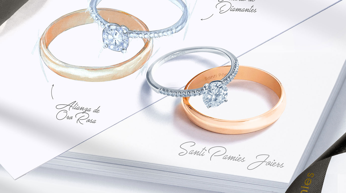
- Names of pieces are nouns, not adjectives. A ring is a name and a number, not a paragraph of feelings.
- Provenance is stated, not romanced. Where the piece is set, who sets it, what the gold is. Plain language.
- Catalan and Spanish read as equals. The site speaks both, with the same care, because the buyer does too.
Trust is built the same way. We did not stack badges. We named the workshop, named the city, listed the stones plainly, and gave the buyer one quiet line about the after sales relationship. A house is a long conversation, not a one off purchase. The site reads like that.
Act 04
Reus first, online second
The store is in Reus and the buyers are mostly local. The website had to honour that without becoming parochial. So the navigation puts the showroom address up high, the hours next to it, and a route link that opens directly in a map. None of it buried in a footer.
Booking a private appointment runs through the same pipeline as the online order. One form, two paths. The buyer who wants to come in for a consultation gets the same care and the same response time as the buyer who is shopping at midnight from a couch.
What we kept simple on purpose
- One language switch. Catalan and Spanish, sitting together in the header, no flag soup.
- One trust line at checkout. The workshop, the city, the after sales note. Nothing more.
- One contact path. Phone, email, in person. No chat widget that nobody mans on a Tuesday afternoon.
By the numbers
- 1 site rebuilt from scratch, end to end.
- Every collection, every piece, recreated in editorial AI imagery against the original studio reference.
- 2 languages shipped together: Catalan and Spanish, equal weight.
- 1 grading pipeline across the whole site. Nine collections, one room.
Where it goes from here
The pipeline that built the launch is the pipeline the team will keep using.
- New collections drop into the same editorial pipeline. The brief is the studio photo and a mood board; the rest of the imagery is generated against it.
- Seasonal moments get their own framing. A bridal capsule, a Sant Jordi piece, a holiday rail. Same lighting language across all of them.
- A short film of the workshop, the way Sparkblade got its hero film, is the natural next step. The room speaks for the work in a way no still ever quite does.
Visit the live site at santipamiesjoiers.com.
